
Surveys · Questionnaire design
Mobile-First Survey Design: Adapting Questionnaires for Smartphones
Many web survey respondents now answer on smartphones. This article explains how phones change survey responses and sets out the main principles of designing questionnaires that work well on small screens.
Many people now complete web surveys on smartphones, often without being asked to. A questionnaire designed on a desktop computer may become hard to read, slow to complete and frustrating to use on a phone. Mobile-first design reverses the usual process: the questionnaire is designed for the small screen first and then checked on larger ones.
How phones change survey responses
Research comparing smartphone and computer respondents has found consistent patterns. Surveys take longer on smartphones, and the extra time comes partly from slower reading and scrolling and partly from the conditions in which people answer, such as being on the move or distracted (Couper & Peterson, 2017). Break-off is usually higher on phones, especially when the questionnaire was not designed for them (Mavletova, 2013).
The quality of answers, however, is often similar. Experiments in which the same people answered on both devices found few differences in measures such as straightlining or the reliability of answers, although answers to open questions tended to be shorter on phones (Antoun et al., 2017). A large comparison of computers, tablets and smartphones found broadly similar data quality across devices when the questionnaire was adapted to the screen (Tourangeau et al., 2018). The main risk of smartphones is therefore not that respondents answer worse, but that a poorly adapted questionnaire drives them away or makes some questions hard to answer as intended.
Principles of mobile-first design
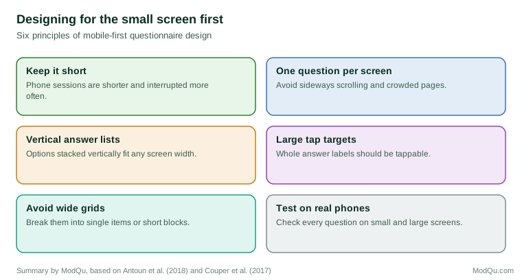
A study that reviewed the design of smartphone questionnaires proposed a set of heuristics for effective design, including readable text without zooming, a simple layout, large and easy targets for tapping and minimal typing (Antoun et al., 2018). Several design choices follow from these.
Grids are the clearest problem. A grid that fits comfortably on a computer screen may require sideways scrolling or become unreadably small on a phone. Experiments have compared grids with item-by-item formats on both devices, and item-by-item presentation generally worked better on smartphones, with less straightlining and fewer problems (Mavletova et al., 2018; Revilla & Couper, 2018).
Answer scales should be displayed vertically when they would otherwise be squeezed. Horizontal scales with many points may not fit, and if the end points are cut off, respondents may not see the full range of options.
Open questions should be used sparingly, because typing on a phone is slower, and answers are shorter. Where open questions are needed, the text box should be large enough to show the whole answer.
Length matters even more than on a computer. Smartphone sessions are often short and interrupted, so a long questionnaire is more likely to be abandoned.
Drop-down lists and sliders behave differently on touch screens. Drop-downs open into the phone's own selection wheel, which hides most options, and sliders can be hard to position precisely with a finger. Simple lists of tappable options are usually more reliable.
Images and video take longer to load on mobile connections and may be resized unpredictably. They should be used only when they are needed for the question, and their file sizes should be kept small.
Text should be readable without zooming, and instructions should be short. Long introductions that fit on a single computer screen may fill several phone screens, and respondents may skip them.
Comparability across devices
When a survey is completed on different devices, the questionnaire may look different on each. If these differences change how people answer, results may differ by device for reasons that have nothing to do with the respondents. A total survey error perspective treats this as a potential source of measurement error alongside differences in who chooses each device (Couper et al., 2017). The safest approach is a single design that works on every screen, such as vertical answer lists and one question per screen, rather than separate layouts for each device.
Measuring the device
Survey software can record the type of device each respondent used. This information should be kept and analysed. Comparing break-off, completion time and answer patterns by device after a pilot shows whether the mobile version works as intended, and comparing results by device in the main survey helps to separate genuine differences between groups of respondents from effects of the screen.
In business surveys
Customer surveys are often sent by email or text message immediately after a purchase or service, and many recipients open them on their phones. For these surveys, mobile-first design is essential. A practical test is simple: before launch, complete the whole survey on an ordinary smartphone, in portrait orientation, without zooming. Any question that is awkward to answer this way should be redesigned.
Conclusion
Smartphones have become a common way of answering web surveys. They take longer and lead to more break-off when the questionnaire is not adapted, but they produce answers of similar quality when it is. Designing for the small screen first, with short questionnaires, vertical answer lists, few grids and thorough testing on real phones, produces surveys that work well on every device.
References
Antoun, C., Couper, M. P., & Conrad, F. G. (2017). Effects of mobile versus PC web on survey response quality: A crossover experiment in a probability web panel. Public Opinion Quarterly, 81(S1), 280–306. https://doi.org/10.1093/poq/nfw088
Antoun, C., Katz, J., Argueta, J., & Wang, L. (2018). Design heuristics for effective smartphone questionnaires. Social Science Computer Review, 36(5), 557–574. https://doi.org/10.1177/0894439317727072
Couper, M. P., & Peterson, G. J. (2017). Why do web surveys take longer on smartphones? Social Science Computer Review, 35(3), 357–377. https://doi.org/10.1177/0894439316629932
Couper, M. P., Antoun, C., & Mavletova, A. (2017). Mobile web surveys: A total survey error perspective. In P. P. Biemer, E. de Leeuw, S. Eckman, B. Edwards, F. Kreuter, L. E. Lyberg, N. C. Tucker, & B. T. West (Eds.), Total survey error in practice (pp. 133–154). Wiley.
Mavletova, A. (2013). Data quality in PC and mobile web surveys. Social Science Computer Review, 31(6), 725–743. https://doi.org/10.1177/0894439313485201
Mavletova, A., Couper, M. P., & Lebedev, D. (2018). Grid and item-by-item formats in PC and mobile web surveys. Social Science Computer Review, 36(6), 647–668. https://doi.org/10.1177/0894439317735307
Revilla, M., & Couper, M. P. (2018). Comparing grids with vertical and horizontal item-by-item formats for PCs and smartphones. Social Science Computer Review, 36(3), 349–368. https://doi.org/10.1177/0894439317715626
Tourangeau, R., Sun, H., Yan, T., Maitland, A., Rivero, G., & Williams, D. (2018). Web surveys by smartphones and tablets: Effects on data quality. Social Science Computer Review, 36(5), 542–556. https://doi.org/10.1177/0894439317719438